Photo of mural in Louisiana, Missouri

What about Regional Art?

My hubby Al and I took a day trip to Louisiana, Missouri, which rests along the  banks of the Mississippi River about an hour’s drive from us. We had heard there were a lot of art galleries and had been planning to visit for years. Unfortunately, we had waited too long. Empty storefronts lined the downtown streets and “for sale” signs were posted everywhere. A reminder of how devastating the economy has been for small town America.

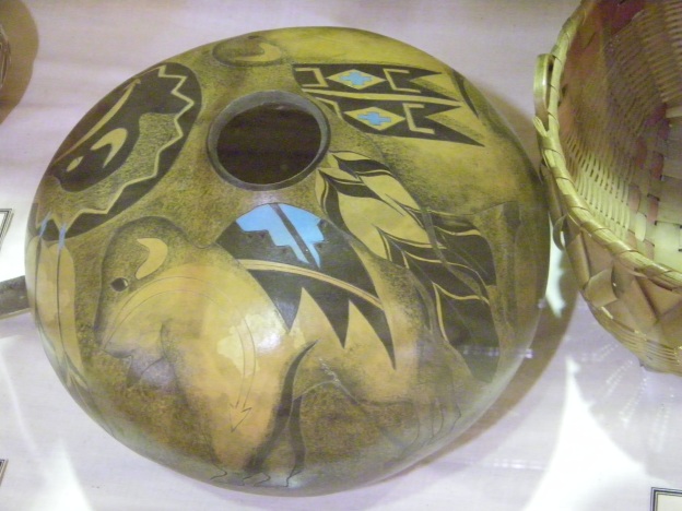
I was particularly saddened for all the area artists and artisans whose dreams were either crushed or redirected. We didn’t find a single gallery or studio. What we did find were beautiful historical mansions and murals. Lots and lots of murals. The artists had left their mark.

It got me thinking about regionalism. What does it mean to be a regional artist? The first thing that comes to mind is artists who paint local landscapes and historical scenes. This is true, but is that the whole story on regionalism? Then I thought about those who only show their work in their region. They would be regionalists in the purist form, but with technology as it is today, I quickly discounted the idea.

Then I hit upon the idea of palette. I’ve traveled throughout North America and discovered that each region’s nature has a different palette. Even the earth, void of foliage, is different colors in different regions. Compare the Southwest’s bleached sand and orange rocks to the Midwest’s rich deep brown dirt and limestone rocks. What if a regional artist paints within the palette of his/her region no matter the subject matter?

Would a portrait artist choose her palette subconsciously by her regional colors? What about a still life artist? It’s obvious a landscape artist would? But what if he was painting a landscape from a different region? How much influence does the local environment have on an artist’s choices? These are questions I’ve never considered before and are food for thought and debate.

I think I’m greatly influenced by my region’s colors. In my paintings I choose colors that  I’m comfortable with. Those that surround me and speak of home, of the Midwest. Looking back at paintings I’ve done from other regions, I see where I may have muted colors to appeal more to a Midwestern eye.

It’s not that you can’t find every color possible wherever you are in the world. For the most part, its more a matter of tones and tints, and which are the dominant colors in each region.

Well, these are just a few thoughts for the day as I get ready for a trip to Florida. I’ll have to visit the local galleries while I’m there to see what’s on their palettes. If you have any thoughts on the topic I’d love to hear. What about you? Do you think your palette is influenced by your surroundings?

photo of pottery in Crazy Horse Museum

Spiritual Painting

Today, I thought I’d share some thoughts about my personal painting philosophy and how I arrived at it.  As I grew as a student artist I often wondered what kind of artist I should be. I truly felt and still do that to be an artist is to partake in the creative nature of God. Definitely not on His scale, but as He is creative how can we not be creative also, since we are created in His image.

When I paint I feel this strong connection with God but I wanted it to be more. How could I express my faith in my art without being didactic? I asked my artist communities and was given the same examples of painting Biblical scenes, like Noah’s Ark. No, that isn’t what I wanted to do.

While still chewing on this bone, my husband Al and I took a walkabout to see the country. It’s amazing how beautiful North America is. We took in all 48 lower states and 6 Canadian provinces and the whole trip that little voice inside me kept saying, “Even the rocks cry out God’s glory.” And I’m thinking, I could paint rocks; I could paint nature in a way that shows God’s glory.

Then we ran across a group of Native American artisans in the Columbia River Valley. They believe that a piece of their spirit goes into whatever they create. So if they have hatred or anger in their heart when they are beading or weaving, that hatred or anger will also be in the art. Their spirit must be pure while they work.  This really resonated with me. I started praying, “Create in me a clean spirit, Oh Lord,” every time I painted.

Then one day a scripture came to mind and it has been my mantra ever since: “Finally, brethren, whatever things are true, whatever things are noble, whatever things are just, whatever things are pure, whatever things are lovely, whatever things are of good report, if there is any virtue and if there is anything praise worthy–meditate on these things.” (Philippians 4:8)

So these are the subjects I paint. Nature, of course, is on top of the list but not totally exclusive.

Does that mean I would never take on a painting of a darker nature. Not necessarily, but I would concentrate on the compassion or hope that lies within the darkness.

So there you have my philosophy. It’s doubtful you will ever see a painting of a Biblical scene from me, but  I hope you feel the presence of God in all of my work.


Rose painted by Lynnette Horn

Contemporary Rose–Final Touches

You know how when you are done painting for the day, the painting doesn’t leave you. It’s still on your mind even when you sleep. Well that was me yesterday. I kept looking at this Contemporary Rose and thinking something’s not right. I had already decided to extend the shadow farther out away from the rose in the lower left corner, but I was using Phthlalo Blue, which is pretty intense for fading out. And as beautiful a color as it is, I found it competing with the rose. By morning I decided to cool it down with a brush mix of Ultramarine Blue and Carbon Black. Ultramarine Blue is less saturated and, at least for me, easier to fade out for an extended shadow. It has the added bonus of being cooler than Phthlalo Blue.

I don’t think it is as distracting from the main attraction now. And I am happier with it. I didn’t remove the Phthlalo Blue, but glazed over it to cool it down.

Today, I also went back to clean edges and add a little more definition between petals. For the most part I used Quinacridone Violet for this. While doing this, I danced around the rose, adding emphasis to small details here and there. I don’t think the average person would notice the difference, but for me these small touches make the rose look more realistic and complete.

All in all, today’s tweaks took about an hour. Really I feel like I can piddle and piddle with it until the cows come home, but there comes a time when an inner voice sets off an alarm, “Stand away from the canvas….eeeeoooo, eeeeoooo (siren)…stand away from the canvas!” I’ve learned the hard way how important it is to obey that alarm after many overworked paintings. So this is the final photo.

All that is left is signing, sealing and varnishing. Now that you’ve seen the final product, let me know if you would be interested in a painting pattern for this. What I’ve shared here is a general summary of the painting process. But a painting pattern would include the line drawing, step by step instructions and photos (more than here) along with tips to achieve the same look.

Now it’s on to the next…

Finessed Contemporary Rose Painting by Lynnette Horn

Contemporary Rose–The Finesse

I had an opportunity to get back to my Contemporary Rose, today. I never know on Al’s days off if painting is going to be an option. But today, he busied himself loading new voice recognition software onto his computer while I painted. I think I am nearing completion of my rose.

What I did today:
First, I deepened the Quinacridone Violet glaze on most, but not all of the petals’ edges. This balanced the yellows, so they don’t seem too intense.

Next, I darkened the center with DecoArt Traditions Raw Umber, and then Added stamen in a mix of Raw Umber and Opaque White. Once dry I added an Indian Yellow glaze over them and dotted the stamen with Carbon Black.

I pushed back the bottom three petals by glazing over them with a thinned coat of Blue Gray. While I still had Blue Gray on my brush, I looked for little triangles between petals and where petals curled under to add more shadows, creating better definition and dimension.

Next I highlighted various petals with Opaque White. Of course, adding my lightest light next to my darkest dark in the center where I want the most interest.

The last thing I did today is add a sit down shadow in Phthalo Blue. Then I added a thin line in a mix of Phthalo Blue and Carbon Black right next to the petals and wherever I wanted shadow and softened.

I think I’m close to done. I was going to look at it once more tomorrow and see how I feel about it. I may push the shadow out farther away from the rose on the lower left side, opposite from the light source. I’m considering outlining the petals and even adding leaves, but then it wouldn’t be as contemporary as I first envisioned this rose. What do you think?

Contemporary Rose, with Glazes by Lynnette Horn

Contemporary Rose–Glazes

Today, I set up downstairs in the breakfast room of our hotel to paint while Al was sleeping (remember–nightshift). I don’t have to use the crutches anymore so I can actually carry things again. It seems like such a luxury now. So anyway I got started on the glazes for my Contemporary Rose.

First, I dressed the canvas in extender and thinned Warm White with a touch of extender also. I painted this over the petals to help blend the shading a bit better. Because I used extender I could still see the grisaille. Once it was dry I started in the center and worked my way out with glazes.

My darkest glaze is DecoArt Traditions Deep Yellow. As you can see in the painting I used this in the center and around the base of the center petals. Next came Indian Yellow, which is an orangey transparent yellow. My last glaze from this hue is Hansa Yellow. From the looks of it I really poured on the glaze, but actually I took my time applying layer upon layer of very thin glaze to build up the color.

Next came Quinacradone Violet for the pink glaze. Each petal was painted first with shape following strokes around the edges. Then I used a small mop to soften and pull in towards the base of the petal. In a later layer, I went back through to add lines and irregularities along the edges.

There is still a lot to be done with glazes, additional details and anchoring the rose on the background. So stay tuned…

Grisaille Rose by Lynnette Horn

Contemporary Rose

Today, I want to share with you the progress on my latest painting, “Contemporary Rose.” It’s based off of a photo I took of a rose in my garden last summer. When the first warmth of spring hit, I remembered this photo and wanted to do something very in your face and springy. My palette evokes spring and makes me smile. I can’t wait to share it with you, but you’ll have to wait for another post.

I base coated this before the tornado took out my house. It was sitting on the kitchen counter when the tornado hit, and surprisingly survived when most everything around it was destroyed, so no matter what I had to finish it. At first, dealing with our temporary living arrangement was getting the best of me. I though it was impossible to paint and I know you heard about my frustrations. But when it got to be too much I found a way. So here is my painting so far and I’ll keep you posted on the progress. I may make this into a downloadable painting pattern if there is enough interest. So please comment if you would like to see this in a painting pattern.

The painting is on a 12″x12″ canvas. After my usual canvas prep, I thought I would experiment a little with the new DecoArt Chalky Finishes. This line of paint is suppose to work on any surface, though most people think of chalky paints for furniture or wood pieces. I wondered how it would do on canvas. I painted one coat of Serene, which is a light blue, with a sponge brush. Coverage was great, but it left some brushstroke marks. It only took a light sanding with an ultra-fine sand paper to bring my canvas back to smooth.

Once it was dry, I transferred the outline of the rose to the canvas and painted it a base color of DecoArt Traditions Opaque White. It took two coats to achieve solid coverage. Then I transferred the rest of my pattern. The next step was to set in the values. Sometimes it is easier to create form when color is not a factor. That’s what Grisaille means–to paint form without color. It is painted in different values of gray. I tried to paint my grisaille in grey values but it looked heavy and out of sorts. It could be because I had already introduced color to my background (light blue). So I wiped it off and started over, brush mixing only Opaque White and Blue Grey for a variety of values. This worked so much better. I deliberately did not create all the value changes I intend to have in the finished painting, because the color glazes will further adjust the values.

I’ll seal this in the morning with a mixture of DecoArt Traditions Multi-Surface Sealer and Glazing Medium. Then it is on to the transparent colors. Stay tuned…

How to Keep Motivated When You Can’t Paint

Okay, frustration is setting in. It’s been a week and a half since having to move into a hotel (for details refer back to my blog “Gone with the Wind”). Finding a way to paint has been nearly impossible. I had hoped to be halfway through a painting by now. I was going to blog each step of the way with photos, but progress has been halted.

The problem is these crutches keep me from carrying my paints to the lobby. I can’t paint in the hotel room, because my husband works nights and sleeps days. I have to keep the room dark all day. At night the lighting is so bad, I don’t dare mix colors. So I’m stuck.  Today, I stood in the bathroom (better lighting) to fix the background of the painting I had just started when everything hit the fan. It was scraped up in the storm, but the canvas survived. I guess you can call that a start. But, standing on a broken foot in the bathroom to paint, is not the most ideal situation. It’s not something I can do for very long.

So basically, I’m not painting. Circumstances may be different, but I’m sure you’ve all gone through times when you couldn’t paint, too. What I’ve discovered is the longer I stay away from the brushes the harder it is to get back to them. But if I can do something art related each day that I can’t paint, it will be easier to pick up the brush when I can. Here is a list of my go to’s for motivation:

1. Study a painting pattern, taking notes on new information and what could be other options to the same pattern.

2. Reading art blogs by fellow bloggers. I also subscribe to a number of artists newsletters. When I’m in the midst of a painting I rarely have time to read them, but I save them all for times like this when I can’t get to my brushes.

3. Collect reference material. If you can’t paint because you’re out and about, make good use of your camera or smart phone.

4. Go through photos. If you are stuck at home or in a hotel room like me, take the time to go through the photos you’ve already taken. Make files of possible contenders  for future paintings.

5. Play in Photoshop. Make composite photos, choosing elements from several photos to create a new design.

6. Visit museums and galleries online. Choose one particular artist or style of painting and research it.

7. Jot down any ideas, reflections or dreams that might lend themselves well to future projects . Some artists keep a journal handy at all times for this whether they are painting or not.

8. Wet a paintbrush in water and practice brushstrokes. I haven’t done stroke work in years, but now would be a great time to brush up that skill.

Okay, I’m feeling less frustrated now. I guess I have lots to do tomorrow to keep me busy. I hope some you might find my list helpful too. If you have anything to add to the list please comment.


Artist Mops and More

A couple of posts ago I mentioned that mops are treated differently than other artist  paintbrushes. First of all mops, with a few exceptions, are not meant to apply paint to a surface but to smooth and soften what you’ve already applied. They also can be used to blend the line of separation between one color and another. They come in several sizes and shapes. Their hairs may be synthetic, camel, squirrel, hog , goat or a synthetic blend. Most are soft, but some are purposely stiff.

When you use a mop you will not wet it with water or extender first. Usually you will want to make light crisscross strokes over the wet paint. But there are times the smaller mops can be stroked or pounced, always lightly. The mop is going to move the paint around and pick up some of it. If you are too heavy handed you may create holes in your work, taking off more than you intended.

I never clean a mop while I am using it. Instead I vigorously stroke it on a shop towel to get most of the paint out of it before using with a different color.  When I am totally done for the day I can clean it. For the large fluffy mops, I prefer not to use water for cleaning. I rub hand sanitizer in the hairs that still hold paint. It evaporates quickly, leaving the mop still soft and floppy. I’ve tried washing my earlier mops with hand soap and water, but they were never the same afterwards. They lost their softness.

Hand sanitizer works well for all mops and is the best option. If you are concerned about drying out the hairs you can use soap and water but the lather can get out of control. Cut the soap down to a minimum and  be sure to rinse thoroughly.

Hopefully, I’ll have some demonstrations on how to use mops, as well as others down the road.

Don’t Sweat the Curve

I just read a fabulous blog by Jennifer Harnett-Henderson about accepting imperfection in yourself. This is a really hard thing to do. We are our own harshest critics. It got me thinking about the anxiety I used to have as a newbie painter. I couldn’t learn fast enough. I was ashamed of being a beginner and embarrassed by my work. What would people think if they saw this piece or that? I saw flaws where others didn’t. I was my own harshest critic.

Because of my critical eye, I would rework and overwork my strokes, striving for perfection but getting mud instead.  This is an easy trap for beginning artists and it took awhile for me to find my way out of it.

I realized that to progress I was going to have to accept where I was–just off the starting block–and show myself the same grace I would show another beginning artist. As I calmed down and started accepting the learning process I quit overworking my pieces and they started taking on a new life and vibrancy (albeit beginner level).

Jennifer shared in her blog “Psalm 46:10: ‘Cease striving and know that I am God.’ In the notes, that ‘cease striving’ means let go, relax.”

For an artist that means no matter where you are on the learning curve–beginner, intermediate or advanced–let go and relax. Accept where you are in the journey and be satisfied. For today it is enough. You are enough. Each day you will grow, but for today relax and enjoy where your skills are and who you are as an artist.

Photo of tornado damage to home

Gone With the Wind

A couple days ago I promised a blog about paintbrush care. Unfortunately, I had to take a few days off because of unforeseen circumstances. As you can see from the photo, we encountered a slight bump in the road. We are all safe. The rest is all stuff. It can be replaced. Most of the art was saved. I’m banged up a bit but nothing serious. I’ll be typing with one hand and hobbling around for awhile but each day is getting a little better.

Now for some brushcare tips that I promised. First, lets look at the parts of a brush. The hairs or bristles are called the head of the brush. The very tip/edge of the head is called the chisel. With an angle brush, the long tip is called the toe and the short side, the heel. The hairs are glued to the handle or shaft and are kept in place by a metal piece called the ferrule. So now that we have the terms, it will be easier to discuss care.

When you first buy a brush, run your finger along the chisel to break up the sizing, and then wet the hairs with water and soap or brush cleaner. If using soap, go for a mild bar or liquid and avoid harsh detergents. There are some fantastic brush cleaners out there, too.  Personally, I use liquid hand soap. Squirt a small amount into the palm of my hand and stroke the brush back and forth in it to get it worked into the hairs, rinse thoroughly. Reshape the head and dry flat.

If there had been paint in my brush, I would repeat the soap and rinse steps until all color is out of the brush. Then continue with the drying. Once dry, dressing the brush head in extender or retarder will keep the hairs from becoming brittle. I use DecoArt Extender Medium.  I put a few drops of it onto a waxed palette, dip my brush into it and stroke back and forth on a clean spot of the palette. Then I pinch wipe out the excess with a folded paper towel,

Acrylic paint, no matter what brand, is very hard on the bristles. The extender will act as a barrier, protecting the bristles. You can use it in place of water to help the paint to flow through the hairs. And, having extender on your brush will help the paint to release during cleaning.

When I paint I usually do not clean my brush between colors. I simply pinch wipe and pick up the next pigment.  The extra bits of color will add harmony throughout the painting. But, there are times when you’ll want to clean paint build up out of the brush before continuing. When this happens, do not set the brush in a water pail or scape it across a ridged pail bottom. Keep the brush shallow and swish it around in the water. Pinch wipe between paper towels and redress in extender, pinch wipe again and you are ready to go.

Try to avoid getting water or paint into the ferule, which could loosen the glue and flay the hairs, so the head will no longer have a sharp chisel.

Mops are a different beast altogether. I’ll try to get back on tomorrow to cover them.

If you find this post helpful, please share with your friends. And, if you have any questions about care and use of brushes, please comment and I will get back with you.